BOSE
In early 2023 Bose and Collins were working on a rebranding project and needed a packaging system to pair with their in development brand. This was an interesting challenge working alongside another design firm and with a brand that was still in flux, meaning our designs needed to be fluid and adaptable to whatever changes might come.
| images courtesy of Enlisted Design
BUILT AT ENLISTED DESIGN 2022-23
TEAM: Miri Chan, Beth Anderson, Sebastian Fraye, Shin Euguchi, Matt Hanzly
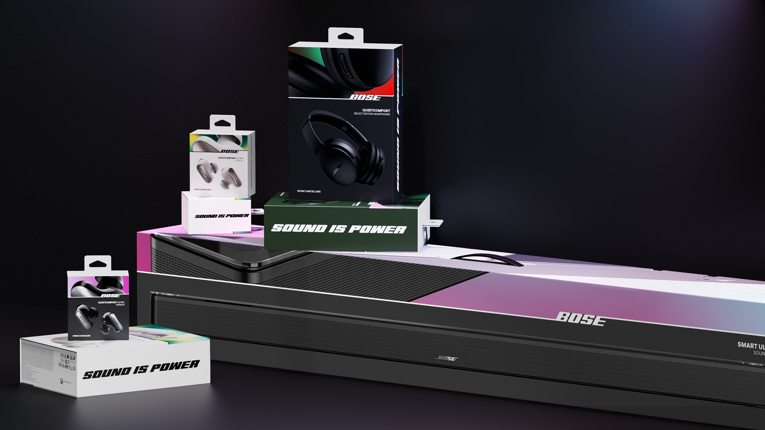
The REBrand
We were brought in to develop a new sustainable package that still felt premium and was branded to fit the new look that Collins was giving Bose. The rebrand was bold with bright images, colors, and strong type. One of the most unique aspects was a system of artifacting, glitching and stretching that was part of the photography and colors.

CONCEPTS
We started by casting a wide net, exploring all aspects of blurring and abstracting the product, plus how it could integrate with the new type system.
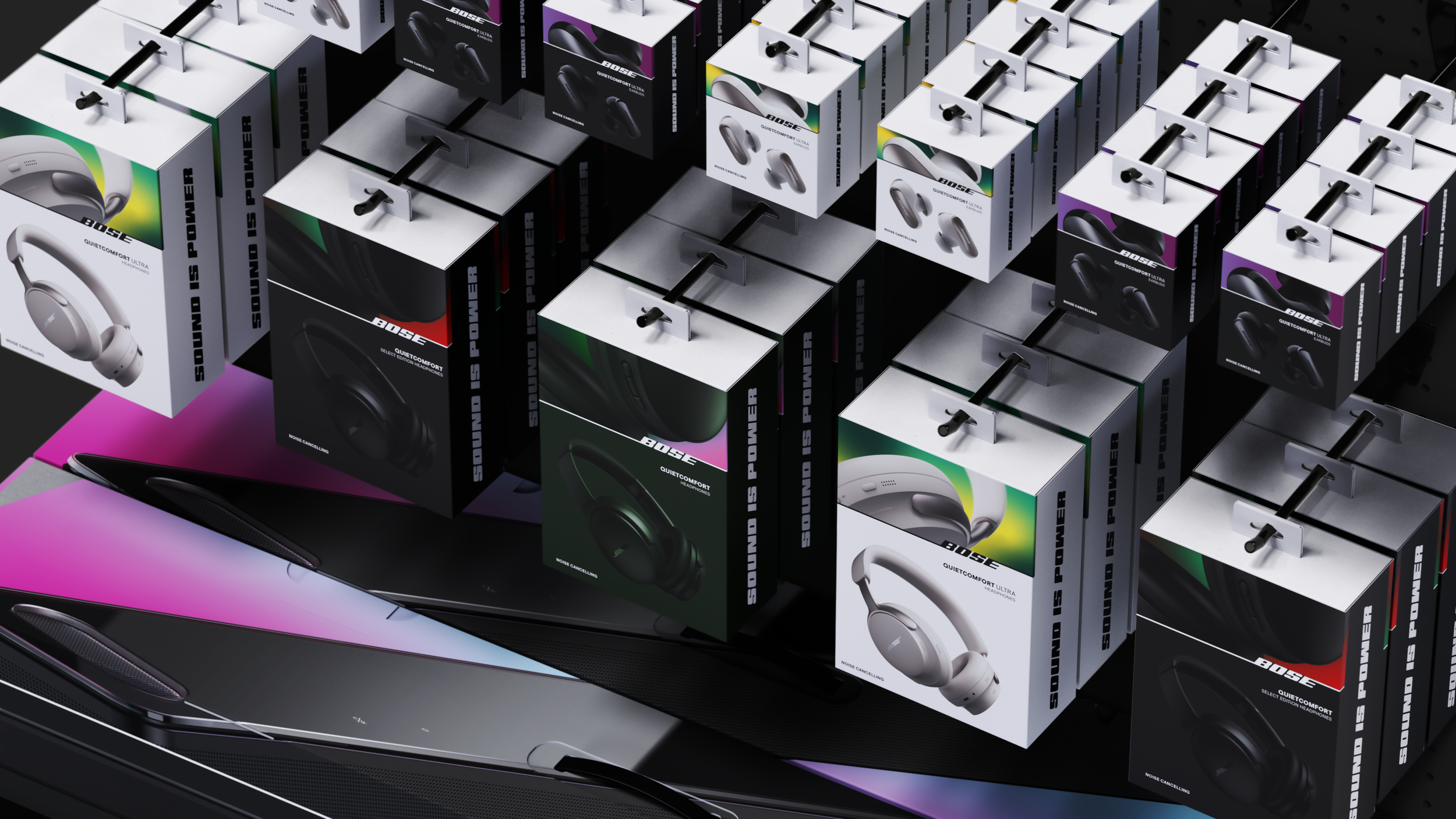
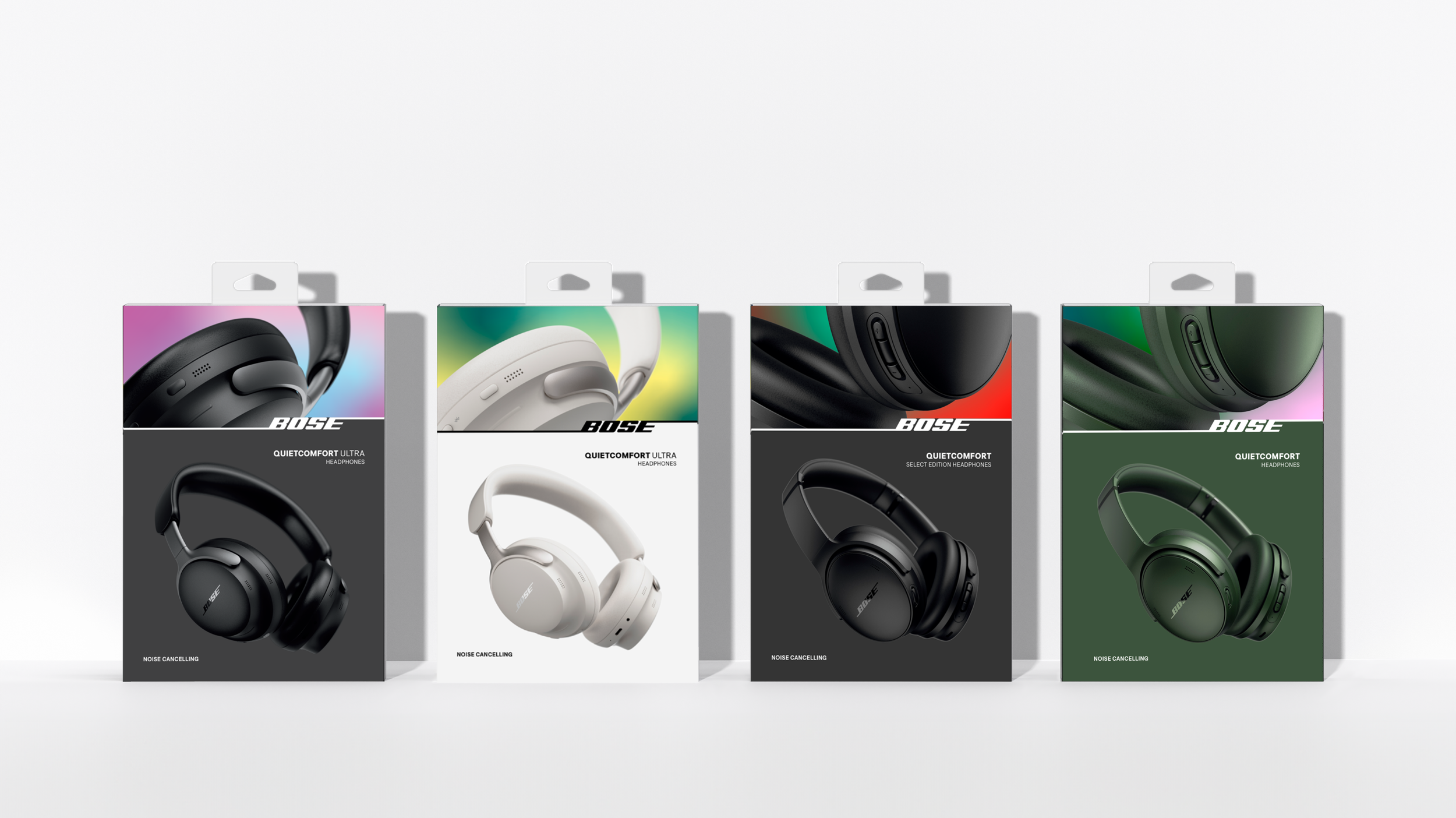
As the branding developed alongside our concepts it became clear the blurring aspects would be represented more subtly with the color system. The color blocking on the package would also have to represent SKU coloring, product tiering, and other navigational needs.
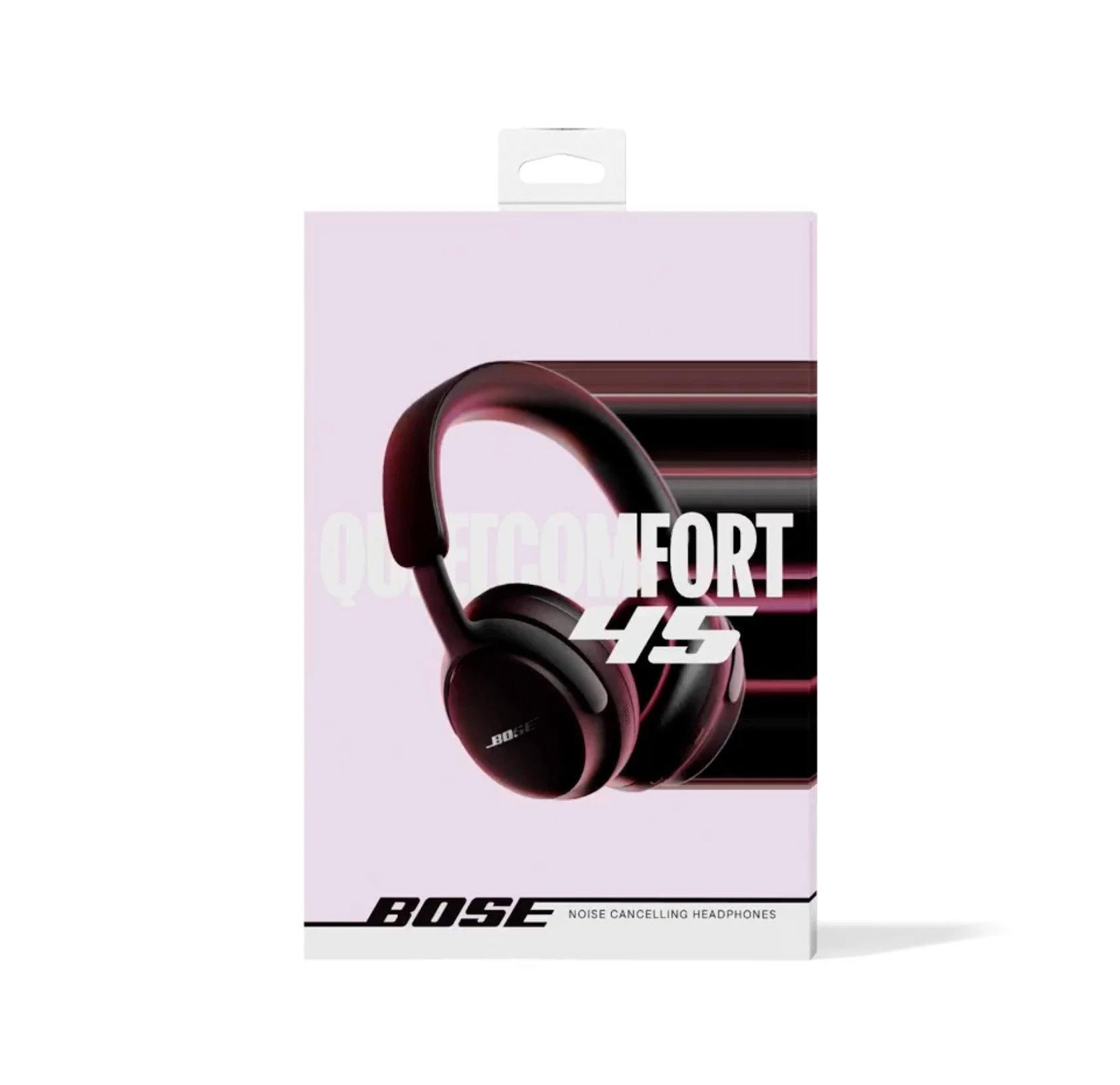
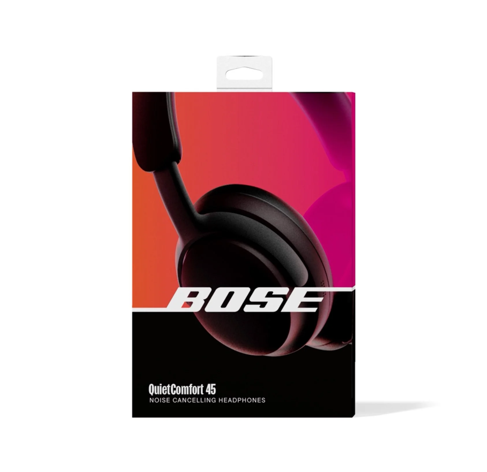
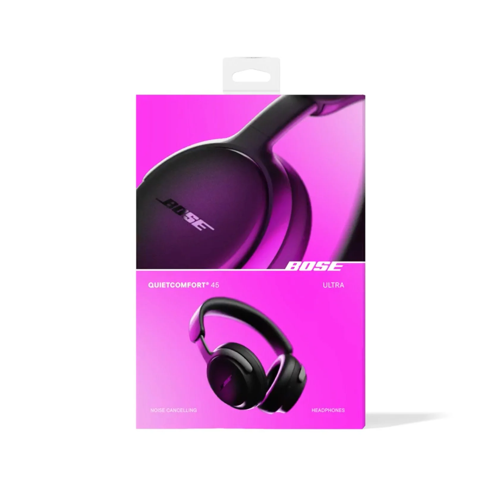
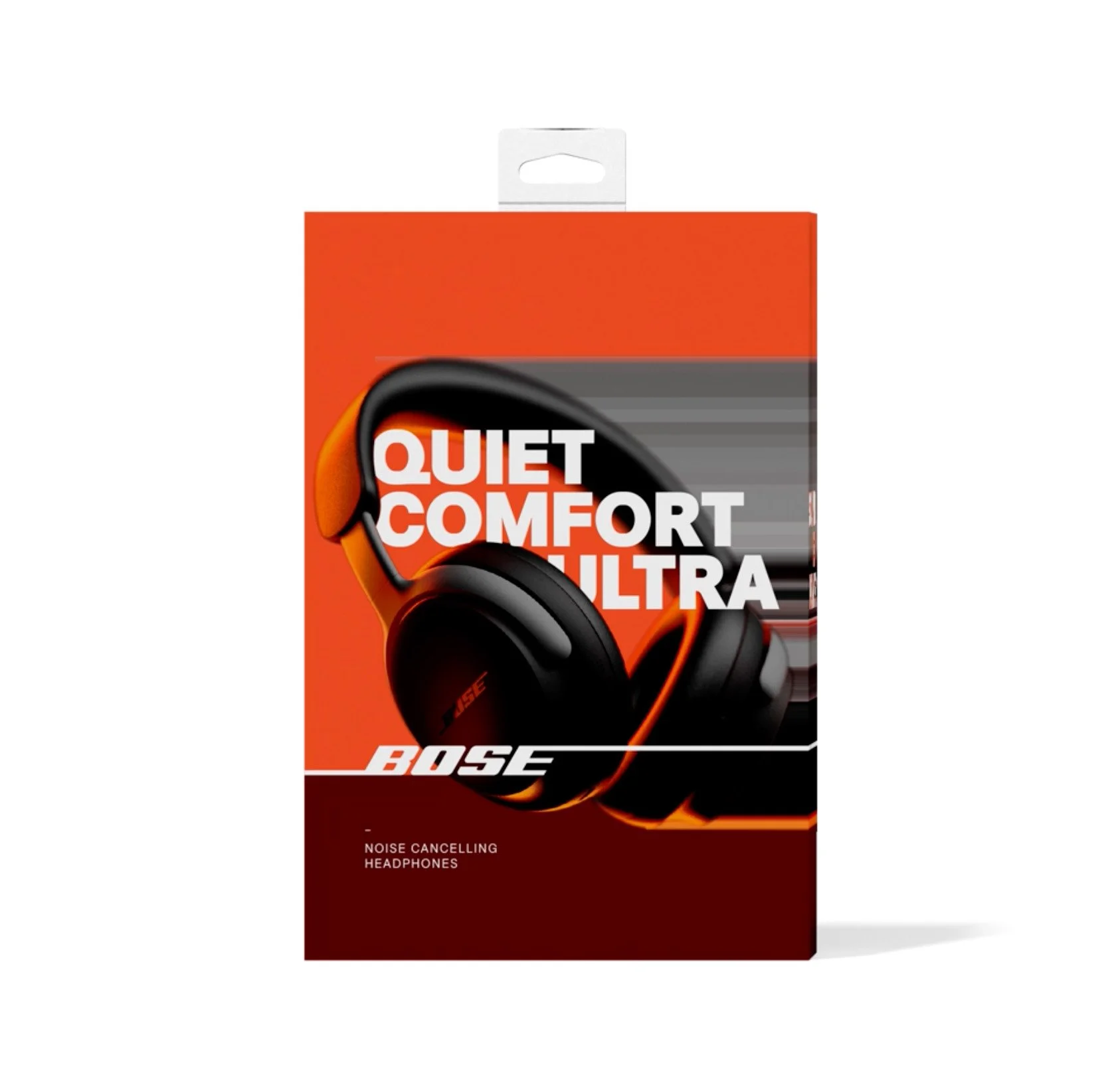
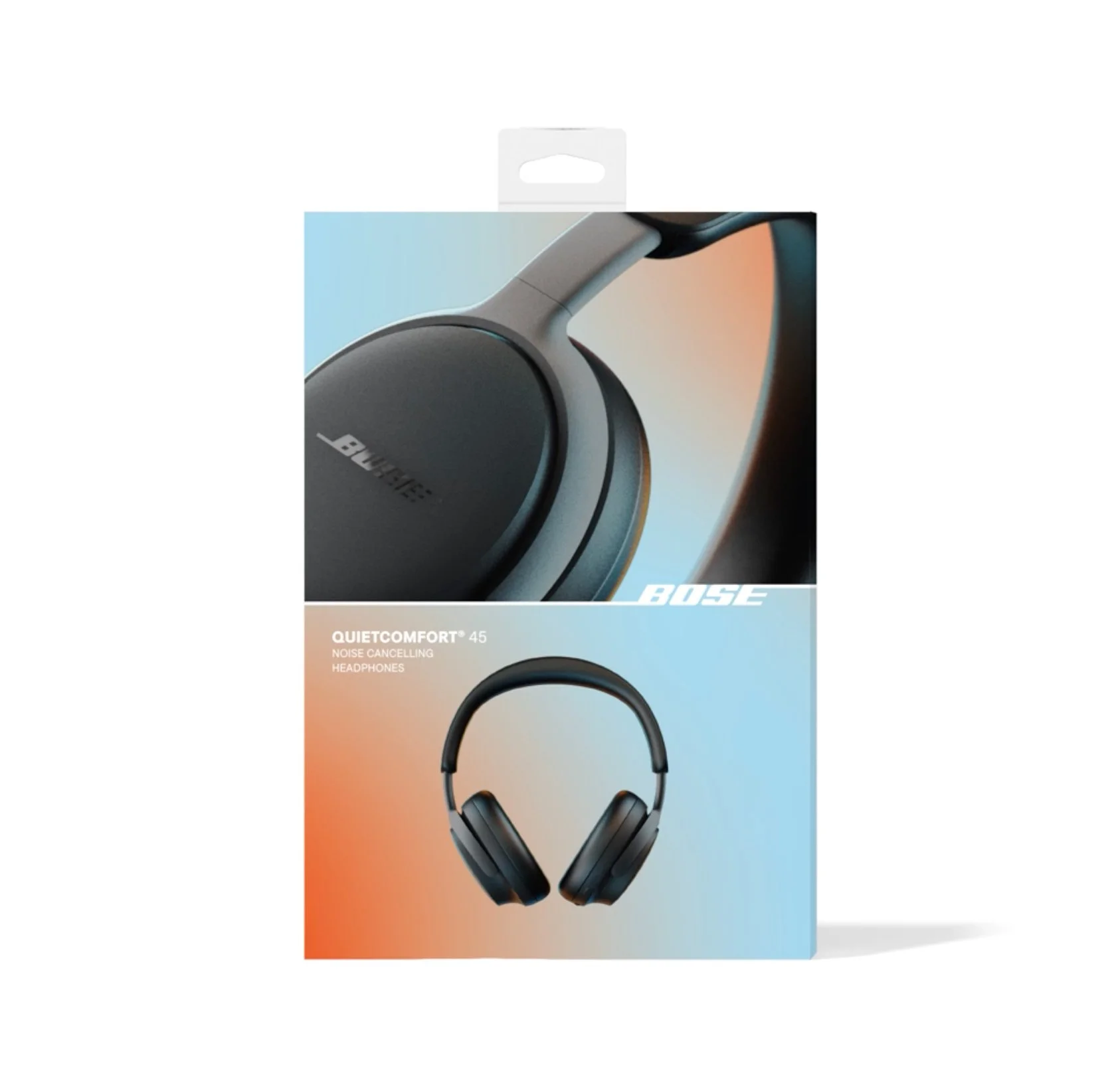
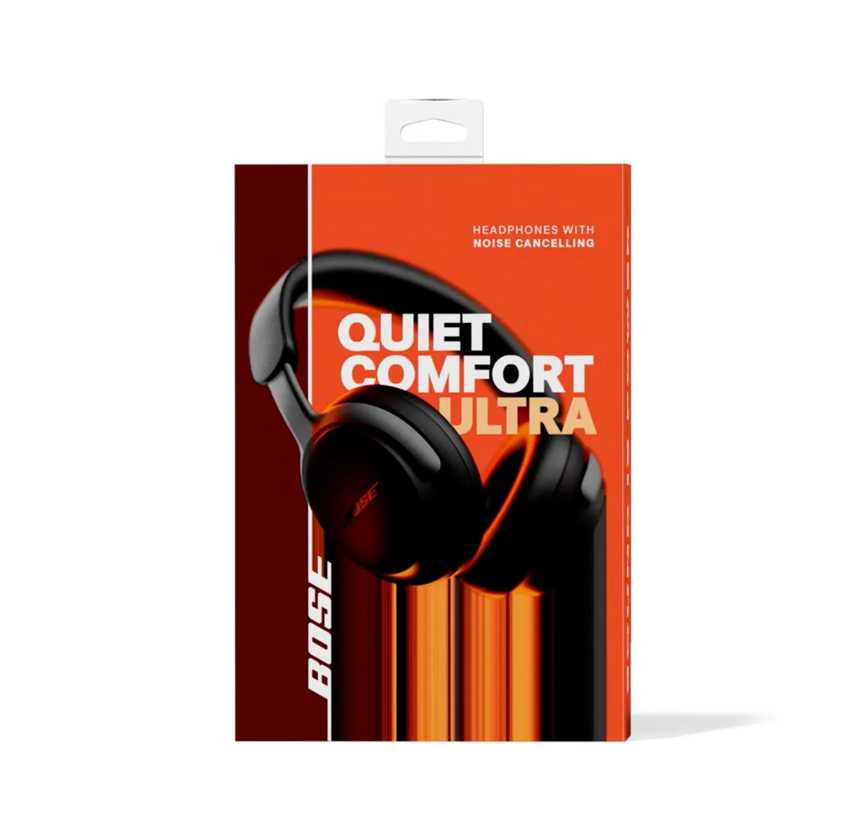
After several rounds of downselecting, this direction was selected. We thought the logo with its new dividing treatment stood out uniquely and the multiple render treatment would let us highlight interesting aspects and tier differences of the product’s design.
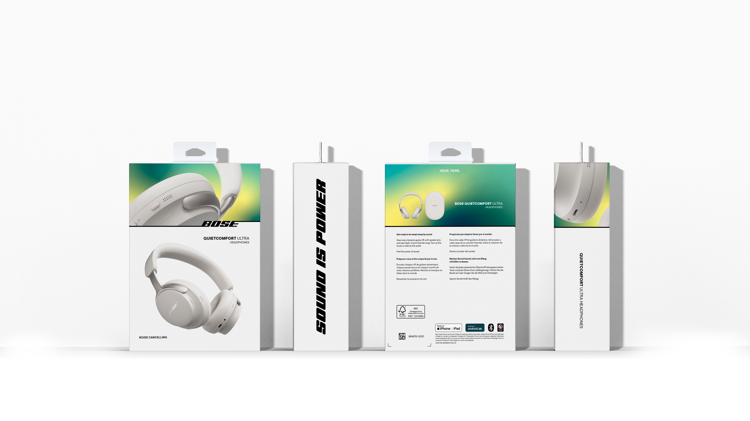
ALL PANEL
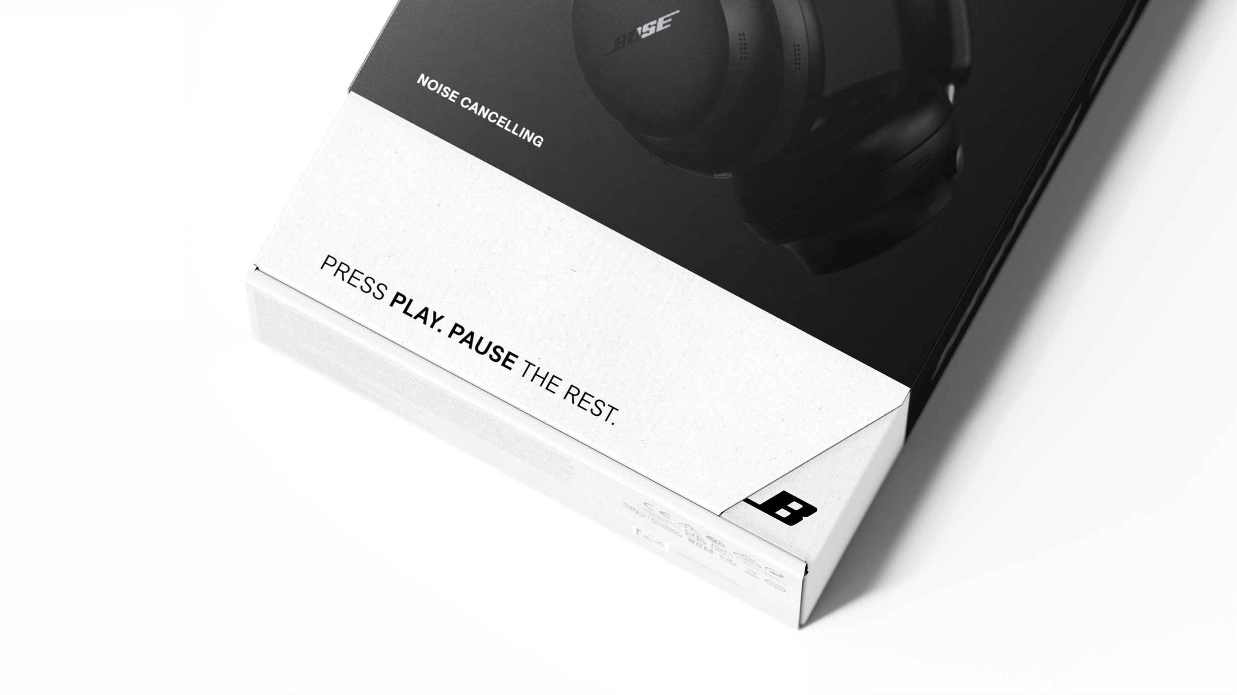
Once we established the front of pack system, we extended to all panel. We used the top detail panel on back of pack to emphasize what came in the box, highlighting charger type, case, and other parts of the product. We also included the new tagline “sound is power” in Bose’s new proprietary typeface based on their logo.
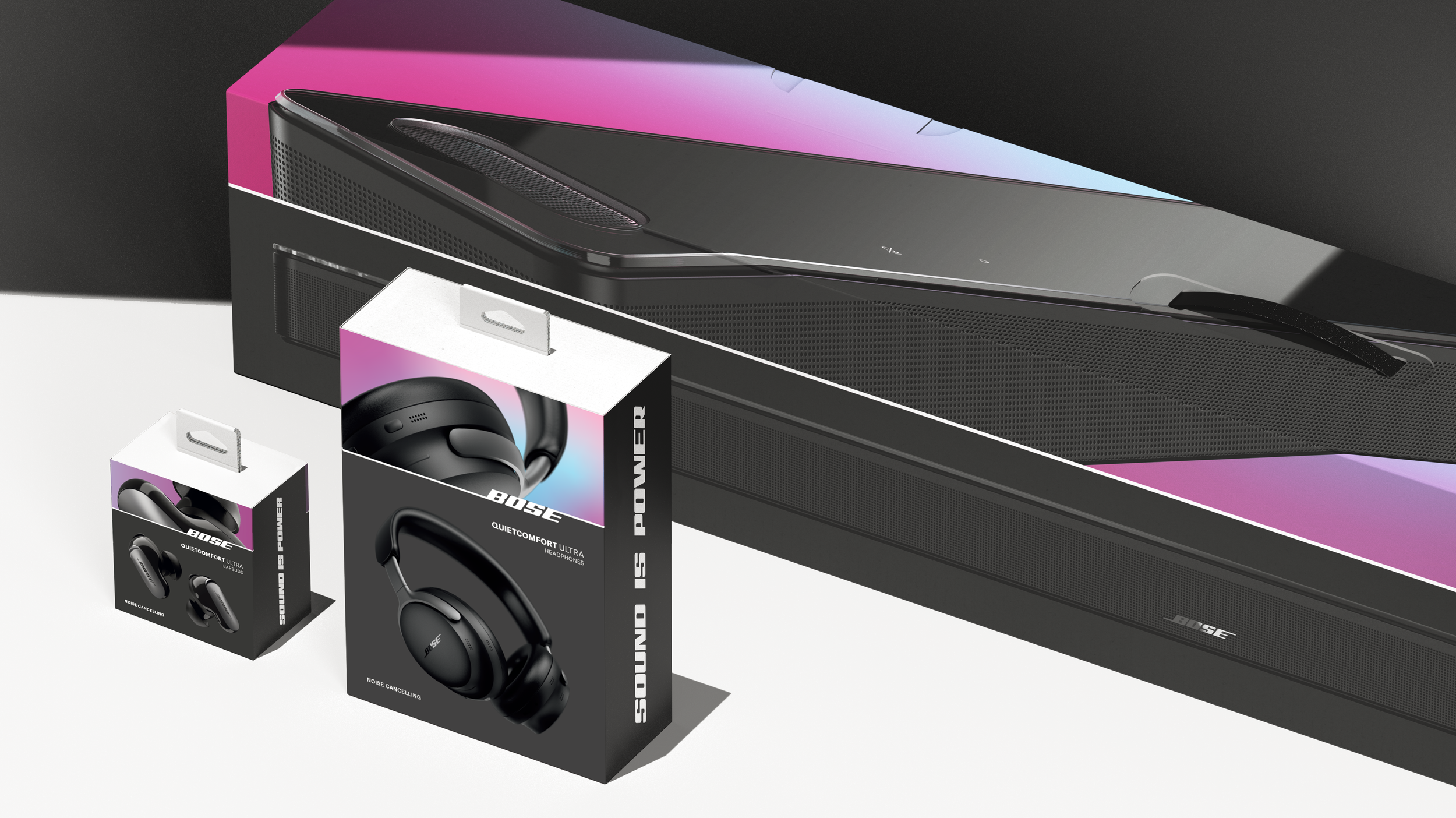
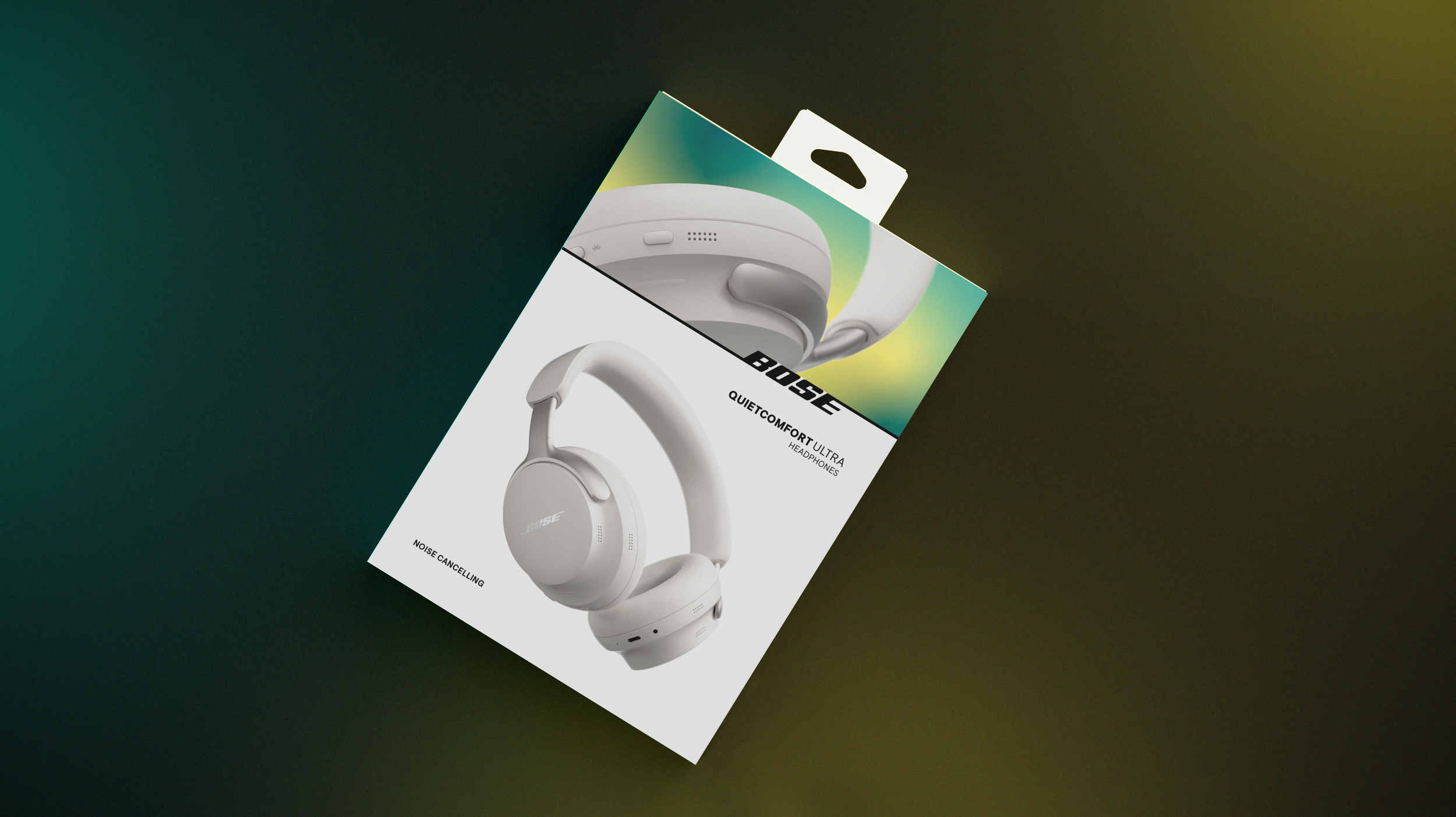
FINAL DESIGN
The selected design was refined into this. We colored the bottom panel to show SKU color and refined the color glitching to the top detail panel. This detail panel’s pattern and color change for the different product tiers and the render shows different button layouts to reflect the difference in product.
see below☟
☜
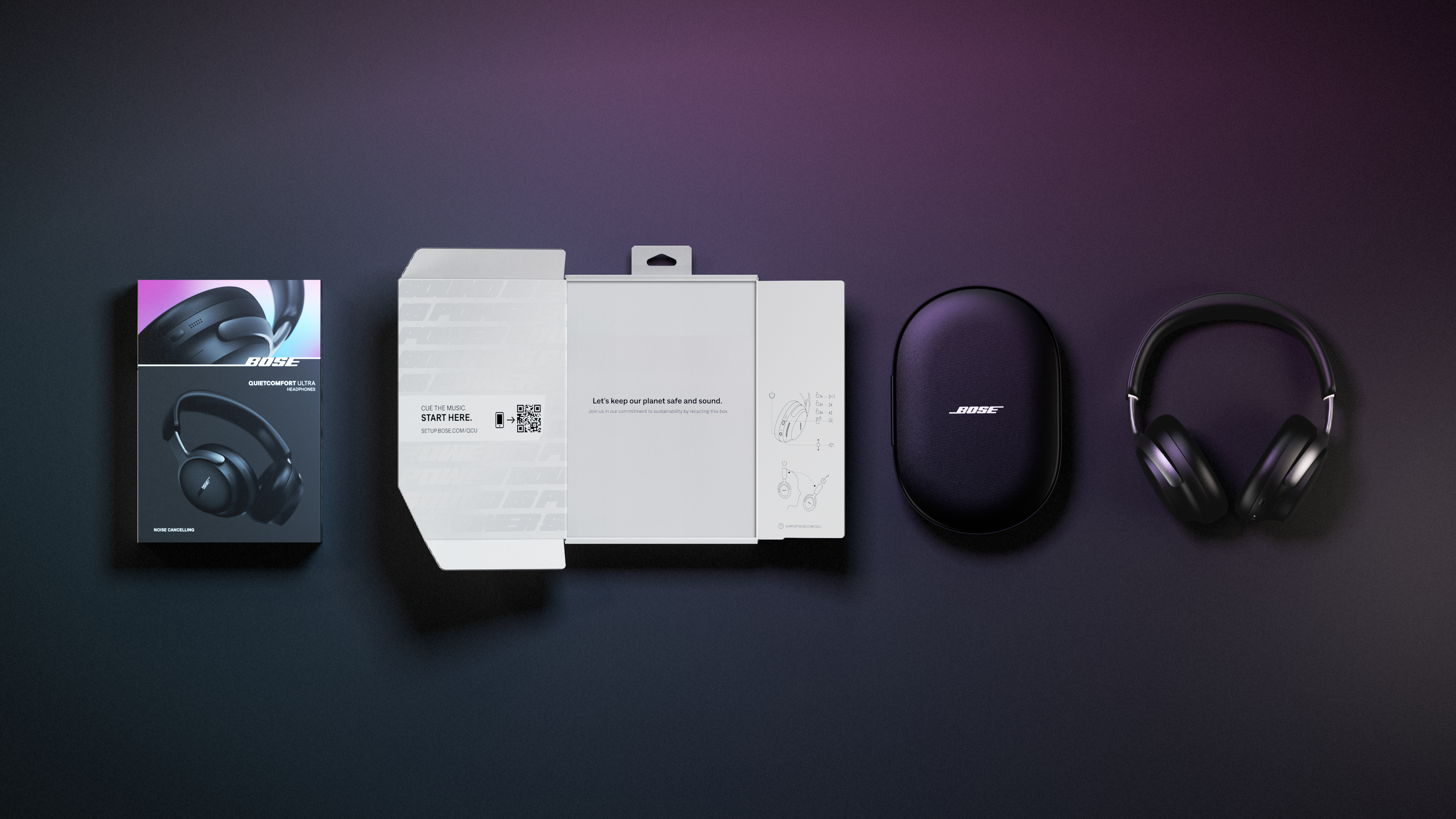
INNER BOX
The new inner box dieline was created by our industrial design team and is a one piece paper design. It was created to use less material, more sustainable material, and simplify production over the old package. We could only print one color and needed to express basic instructions and a QR code to an advanced setup guide, plus messaging to highlight the new sustainability features.