
FRUIT SMASH
During the rise of hard seltzers we were approached by New Belgium Brewing to create a can aimed at the carefree, summer pool party crowd. Inspired by brands like Chubbies we created a new approach into the seltzer market.
Our challenge became balancing the playful vibe of the our audience with still clearly appearing as an alcoholic beverage, with a level of maturity and quality. We had aligned on an illustrative approach by the time I joined the project, and we began exploring illustrative styles immediately.
| images courtesy of Enlisted Design
BUILT AT ENLISTED DESIGN 2021
TEAM: Beth Anderson, Mega Tjhin


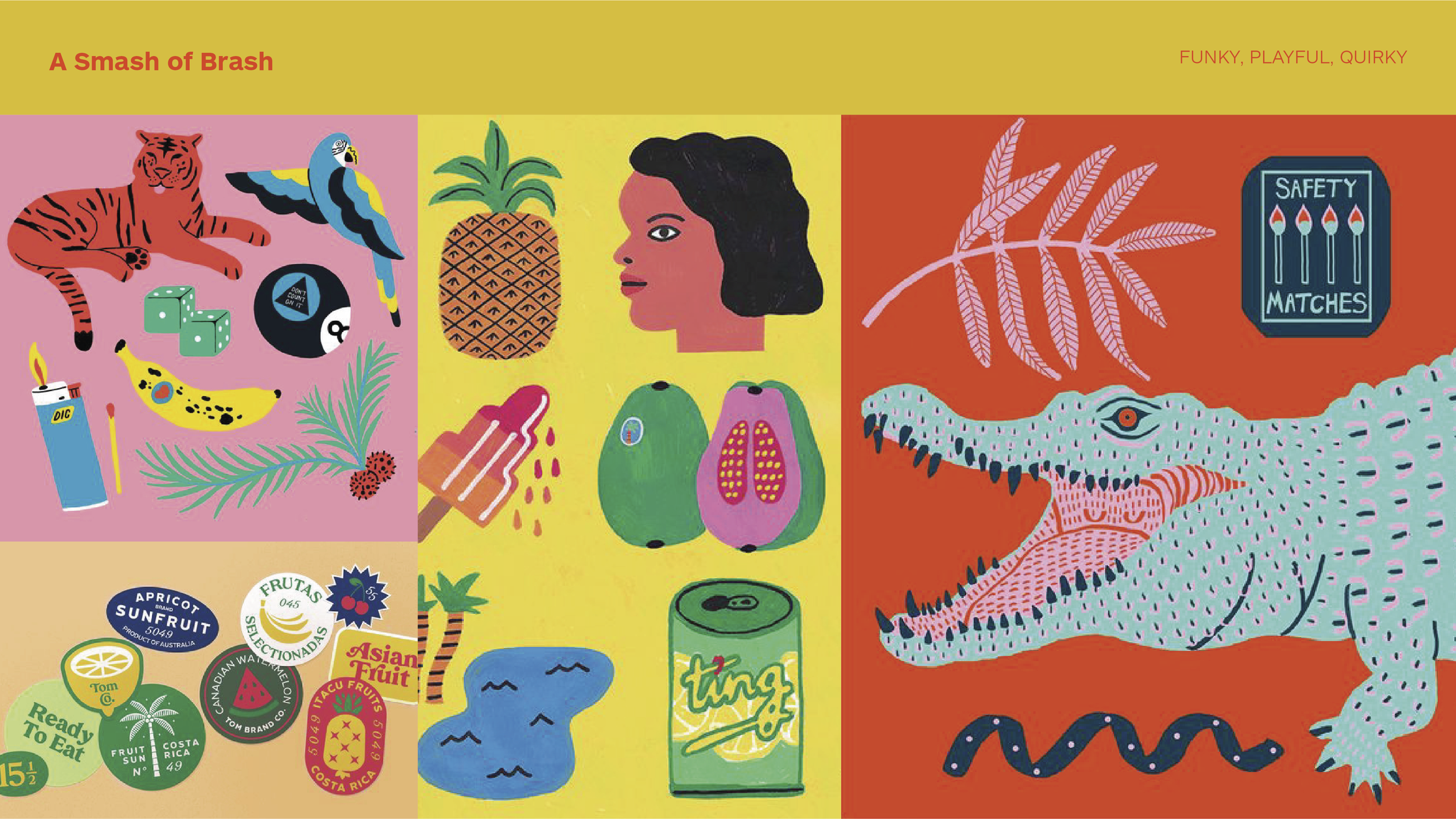


Selected vision board
The concept “Real Fruit. Real Fun.” was selected. This direction was ideally suited to the category as no one was using collaged illustrations in this way at the time. The idea of the hero mascot was introduced here from the alligator illustration in the vision board. We knew the multiple flavors would need to stand apart, so we decide to create a party animal character for each one.
We began hunting for illustrators and experimenting with layout.

Selected Direction
We selected three different artists and completed different layouts for each of their illustration sets. In the end the middle layout, designed by a local Oakland tattoo artist in watercolor, was selected.


The Series
In our next phase we built out the series into the three flavors that would come in the company’s variety pack. We refined overall design, and vectorized the watercolor illustrations. After one last round of minor updates the product launched.


