In 2023 we were approached by Mark Rober and his Crunchlabs team to build packaging and branding for their new science education kit, the Hack Pack. The product would be a monthly subscription box, similar to their existing Build Box product, though this one was designed for an older audience and brought coding and a sleeker look into the mix.
| images courtesy of Enlisted Design
HACK PACK
BUILT AT ENLISTED DESIGN 2023
TEAM: Miri Chan, Beth Anderson, Sebastian Fraye, Sam Peart, Ryker Kimball
LOGO EXPLORATION
Everyone on the team codeveloped logos to pair with their packaging concepts. This is an evolutionary chart of the stages I went through on my exploration to get to my final design which was ultimately selected by the client to pair with some of the other packaging concepts.

The “X”
After a number of rounds we downselected to a few favorites, each paired with their own packaging concepts. The client wanted something with a lot of energy that spoke to an almost superhero logo aesthetic.
This logo was entirely hand drawn and not based on an original typeface. Everything was visually balanced due to weight oddities that appeared with the forced perspective of the logo.
One of our other team members even turned the logo into an animation, which you can see below and all over Youtube!

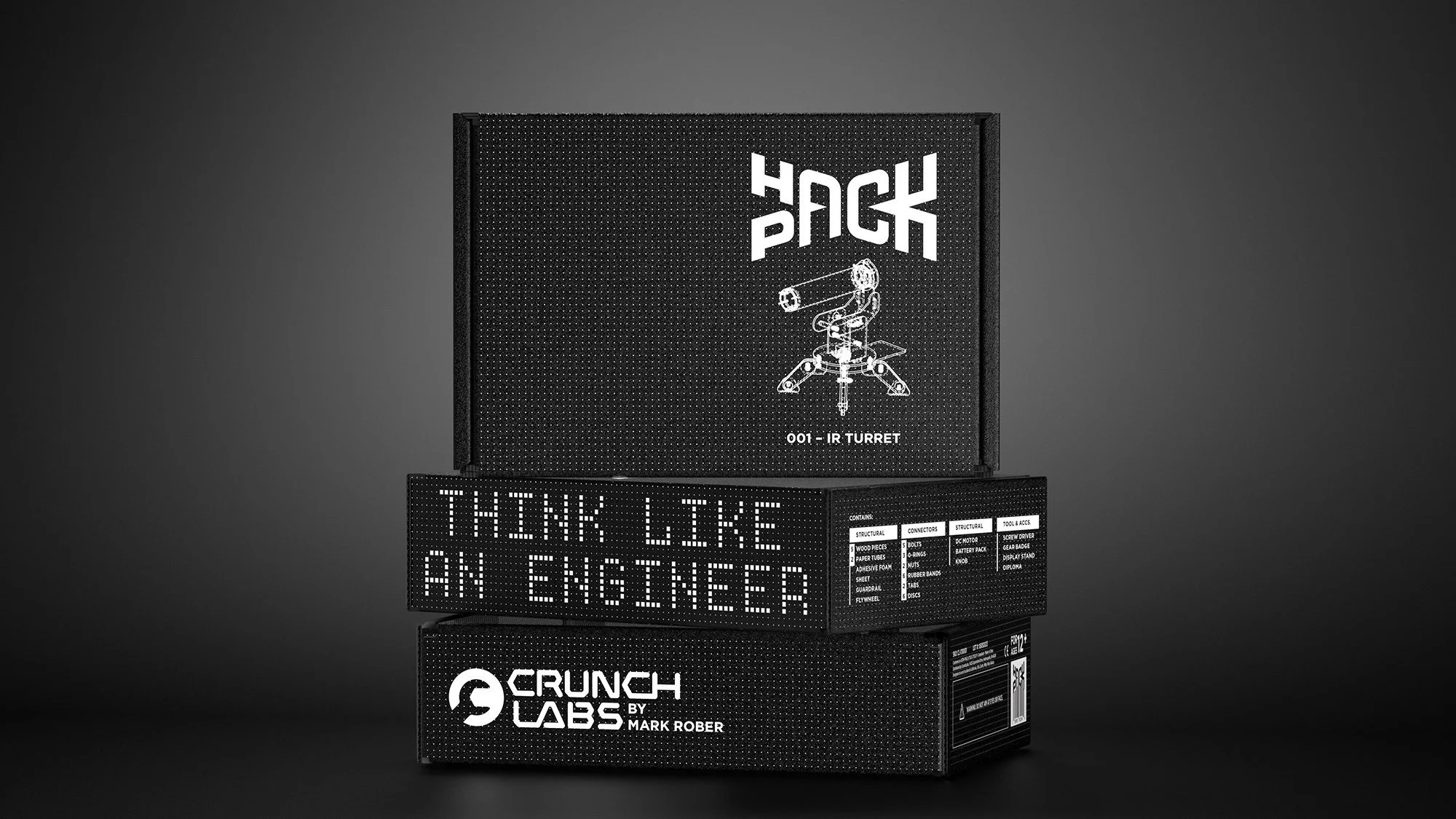
THE BOX
We knew that Hack Pack would have to have a connection with the previous Build Box, put with a more grown up asthetic. The dielines would be shared, meaning we could print on either craft, or single color on black, giving us two main options to explore. The front of pack would also need a shipping label which takes up the left side of the box, limiting our design real estate.

Early Rounds
As the packaging started to develop alongside the logos, I got very interested in how pattern and elements would wrap the package, many of my early explorations followed this wrapping aesthetic. I also wanted to celebrate technical elements like the parts list and blow them up to a large organized graphic, reflecting the adventure the person receiving the box was about to go on.
The color palette needed to reflect some of Crunchlabs’ brand colors, but stand apart from the existing Buildbox’s palette. The client also stressed the importance of the palette remaining gender neutral and having a heavy hit of black.


LATE REFINEMENT
By this point in the process we had downselected to a single logo design, but were still trying to decide between printing color ink on the craft box or white ink on a black box. We ultimately went down the single color road, elements of the final design can be seen with these late round concepts. These include the product diagram, dot grid, logo and type placement.
The final box can be seen below-a combination of many ideas from our whole team. Working with this client was a unique and interesting experience since they had us carry forward design elements from almost every concept each round to create a true merging of ideas.