STELLA & CHEWYs
Capitolizing on the cultural bacon craze we developed naming, branding, and packaging for Stella & Chewy’s new bacon treat product. Simultaneously we built a wet topper, and shredded meat topper, stretching the design system in new directions.
| images courtesy of Enlisted Design
BUILT AT ENLISTED DESIGN 2019
TEAM: Miri Chan, Mega Tjhin
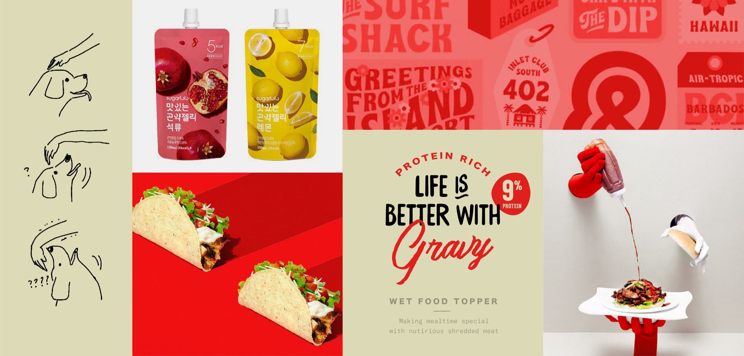
Our process started with a detailed competitive audit, we paid careful attention to everything from themes, language, heirarchy etc. In our same categories and aspirational unrelated categories.
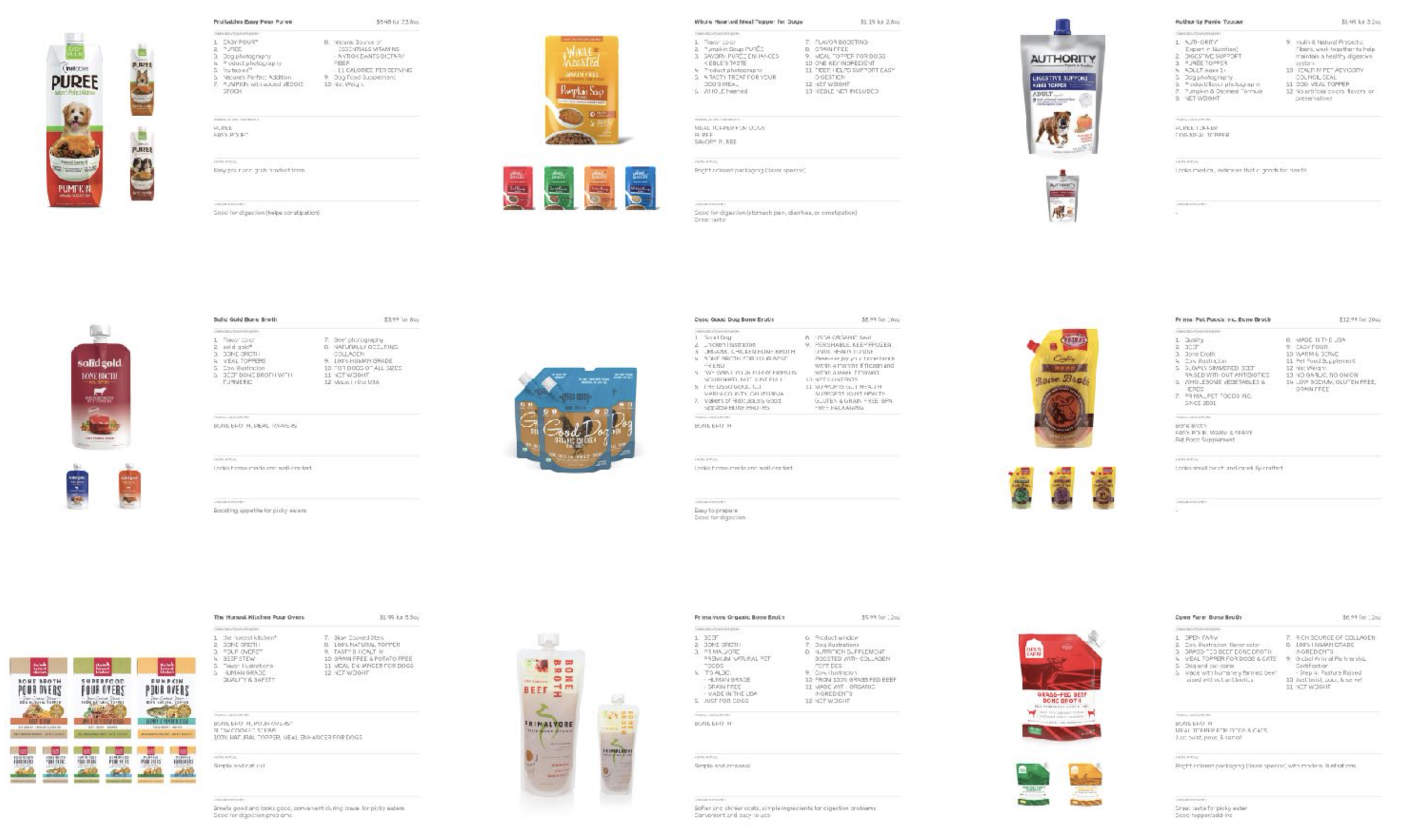
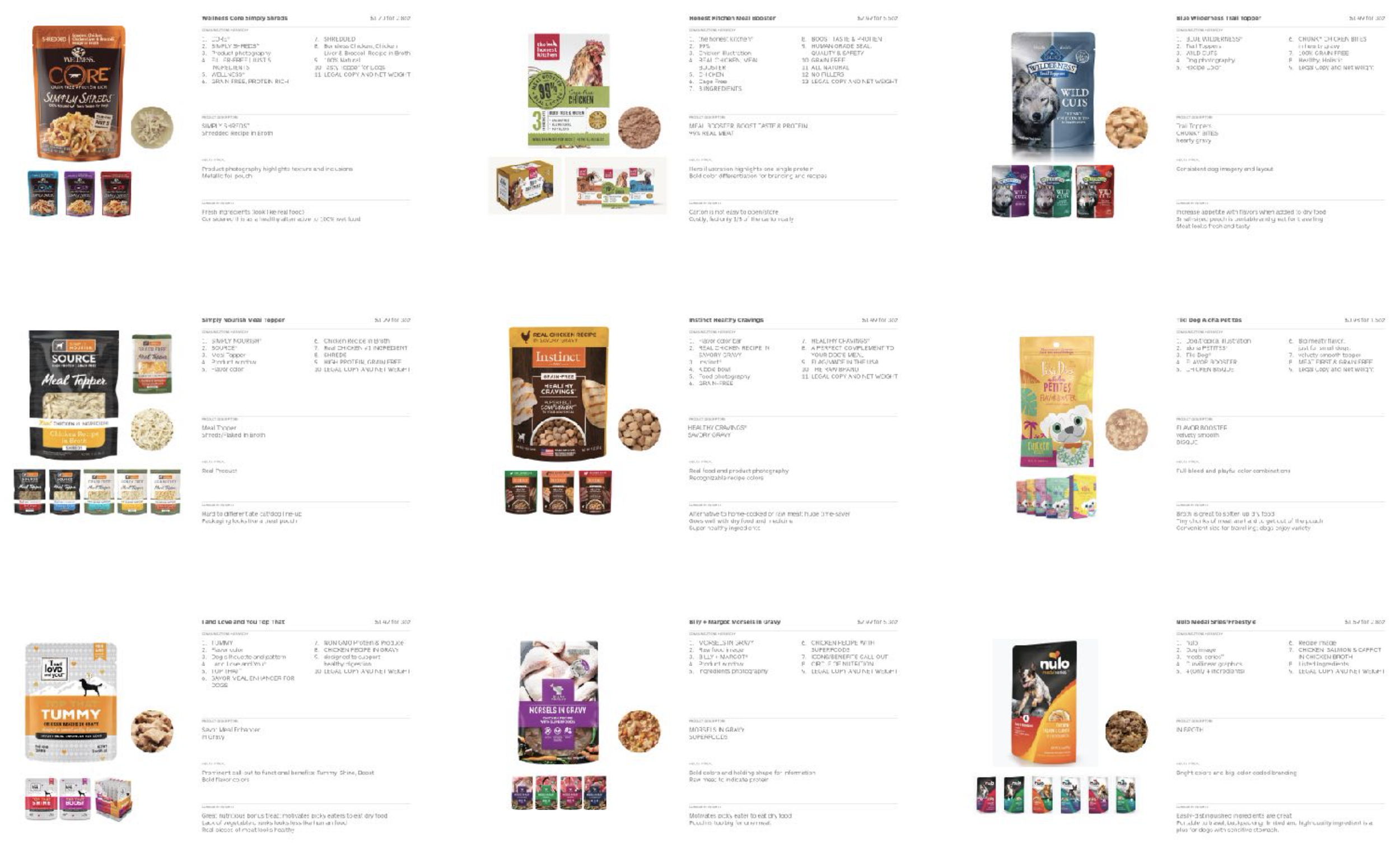

We distilled our research into key learnings for each of our three products:
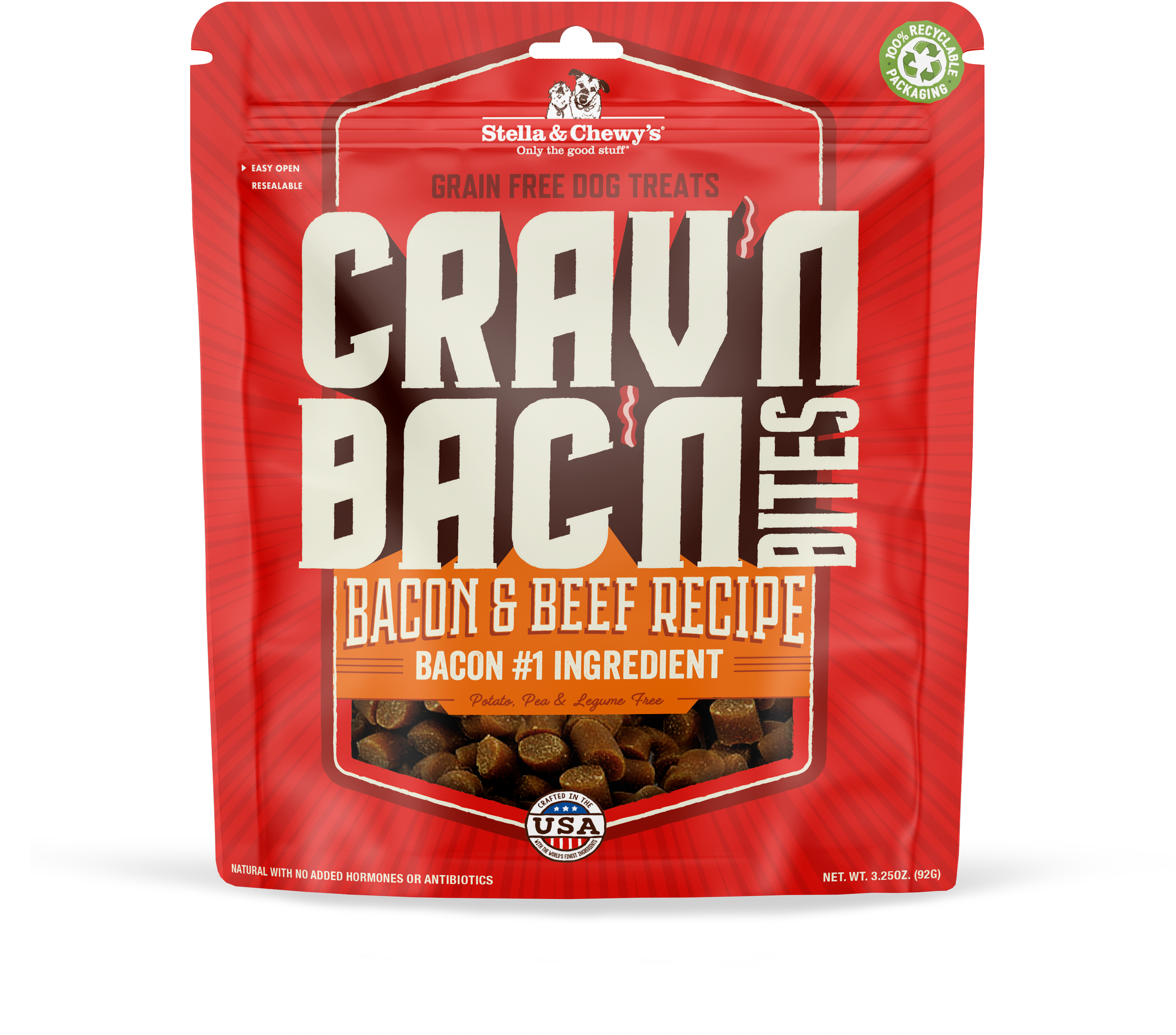

CRAV’N BAC’N
The bacon treats would need an ownable name, and would exist in a category where all the competitor use dog & bacon imagery.
We decided to pursue a type driven direction using bold hand lettering, which celebrated the excessiveness of bacon culture, when combound with background elements and color made a product that jumps off the shelf and is unapologetically bold. We retained brand equity with the strong use of red, and the overall layout and shield form border.
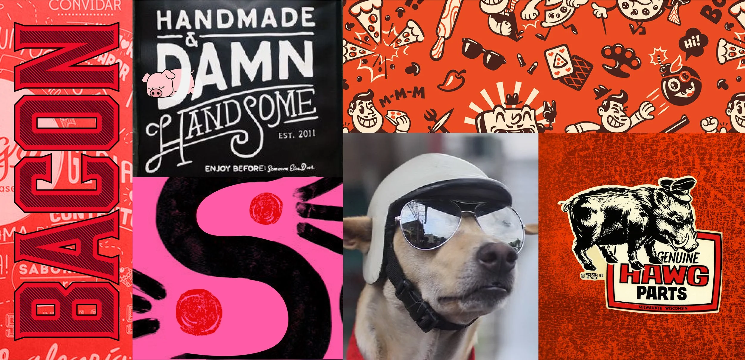
Selected vision board

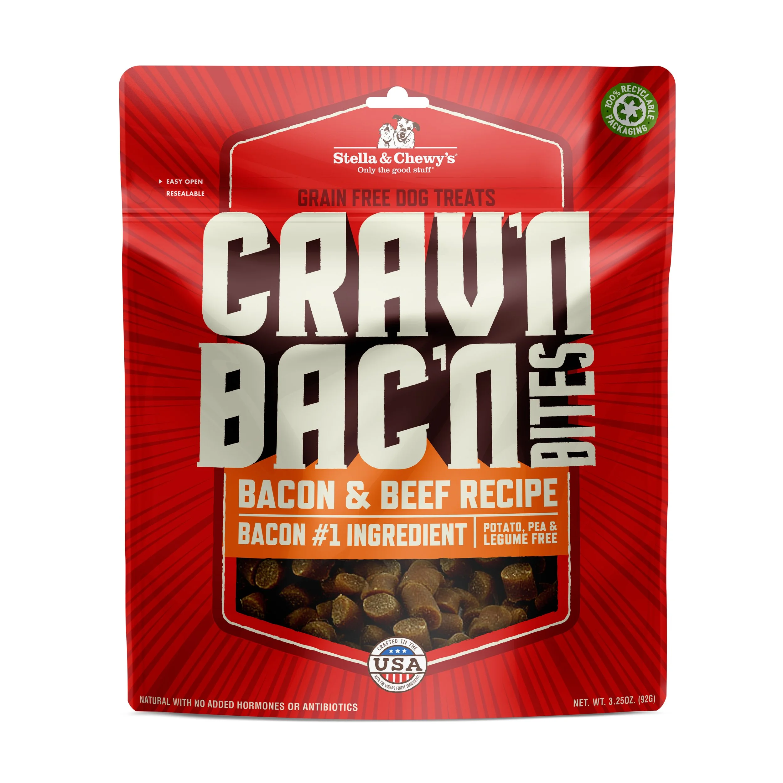
Round 1
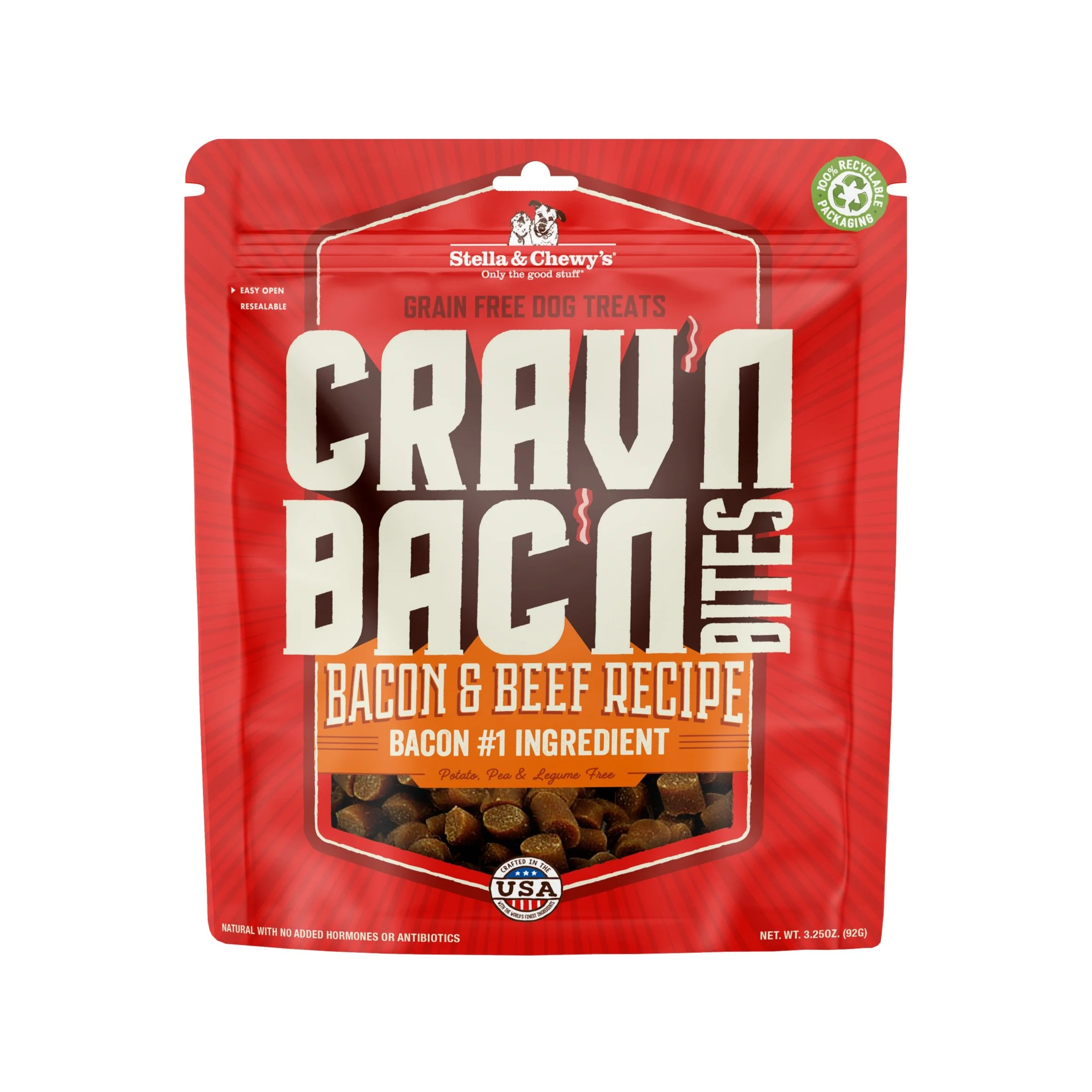
Round 2
Design Intent
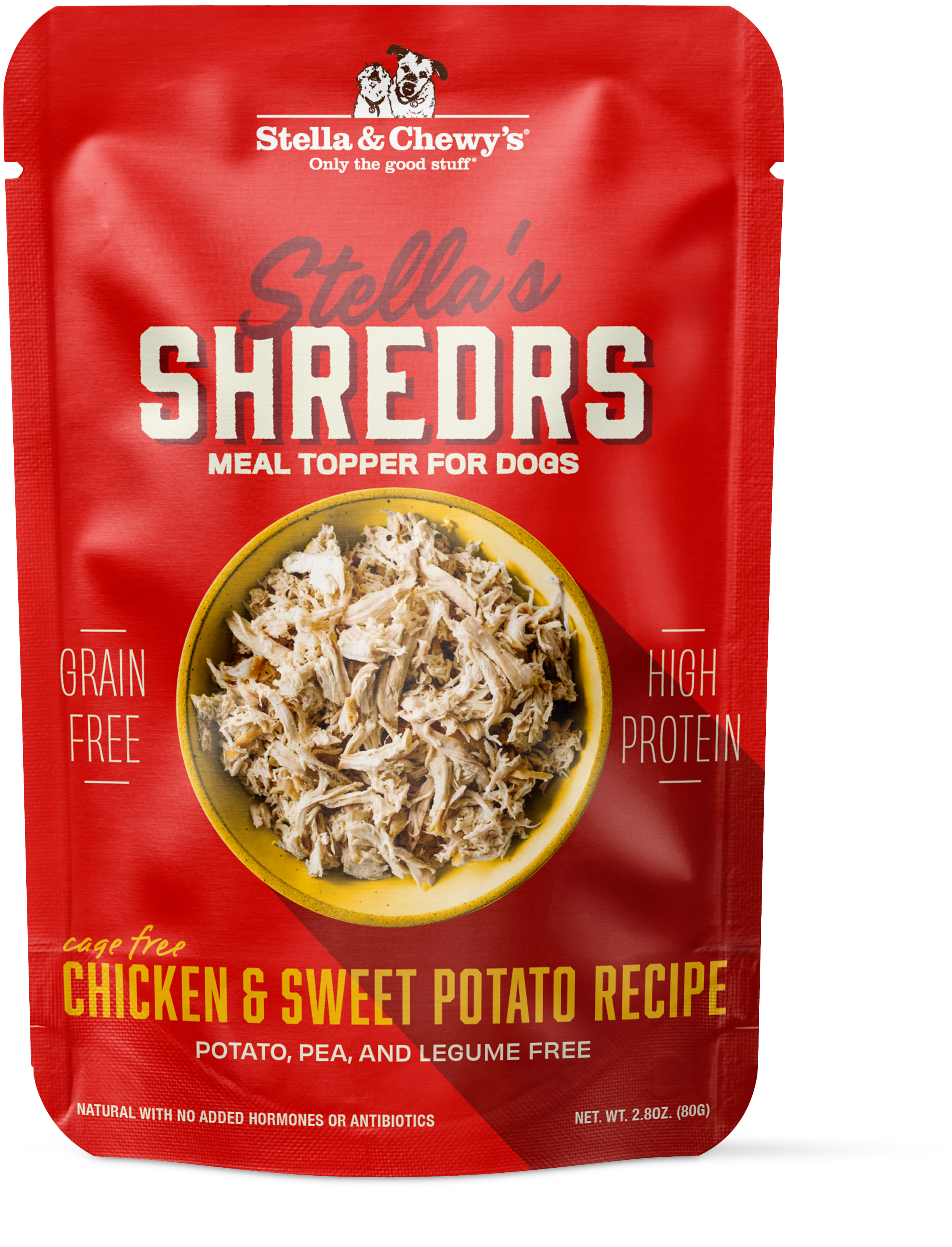
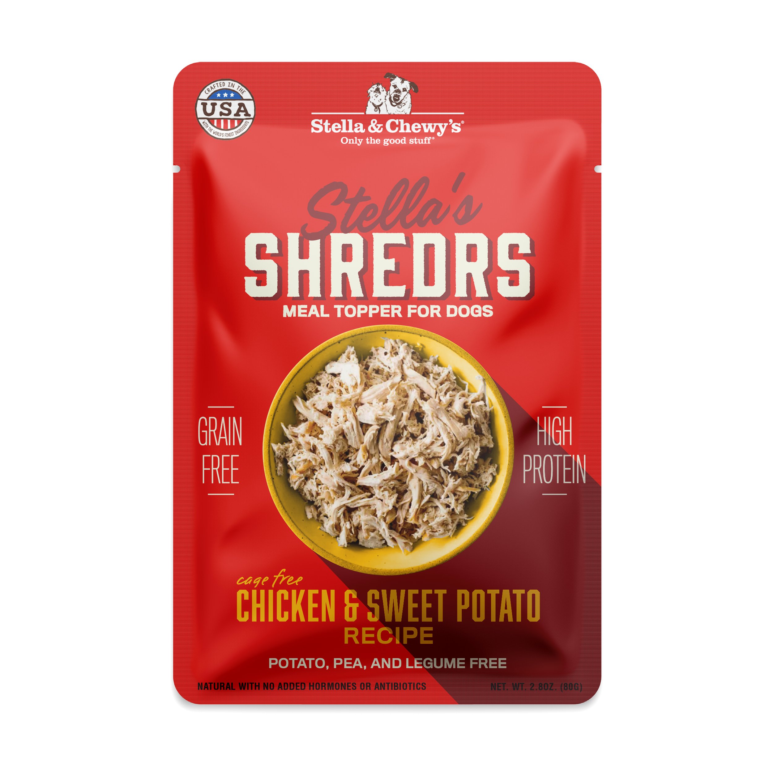
Stella’s SHREDRS
Stella’s Shredrs were driven by photography, the selling point was the real shredded meat in the product. We wanted to highlight it as much as possible and not in the standard half a bowl at the bottom of the pouch way. We decided to take an editorial angle and treat all the elements as on the same plane, having the shadow of the bowl interact in a playful way with the other type elements. In addition the bowl served as a way of helping us distinguish recipe, it would change color along with the type to help distinguish the different varieties of product.
Selected vision board

Round 1
Round 2
Design Intent

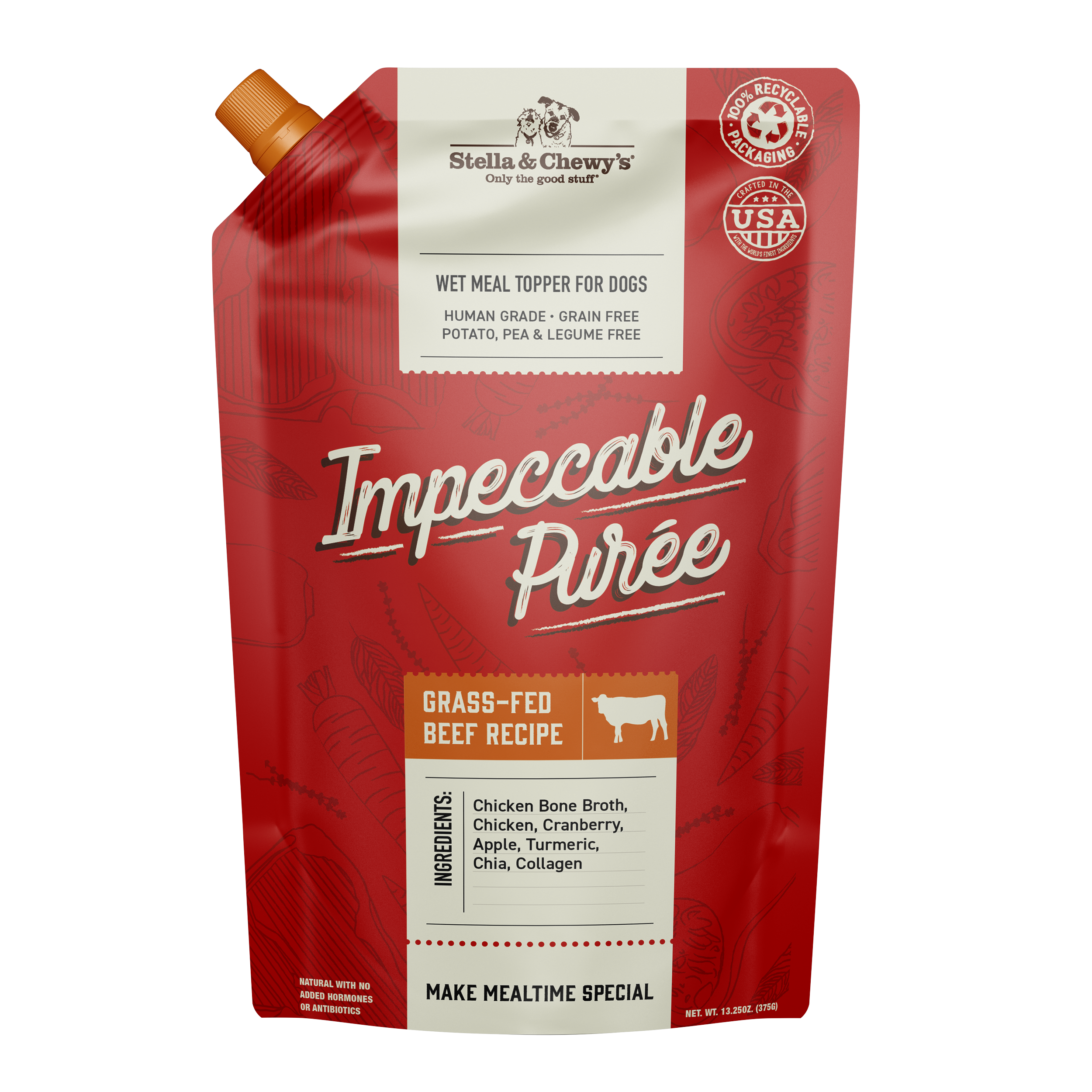
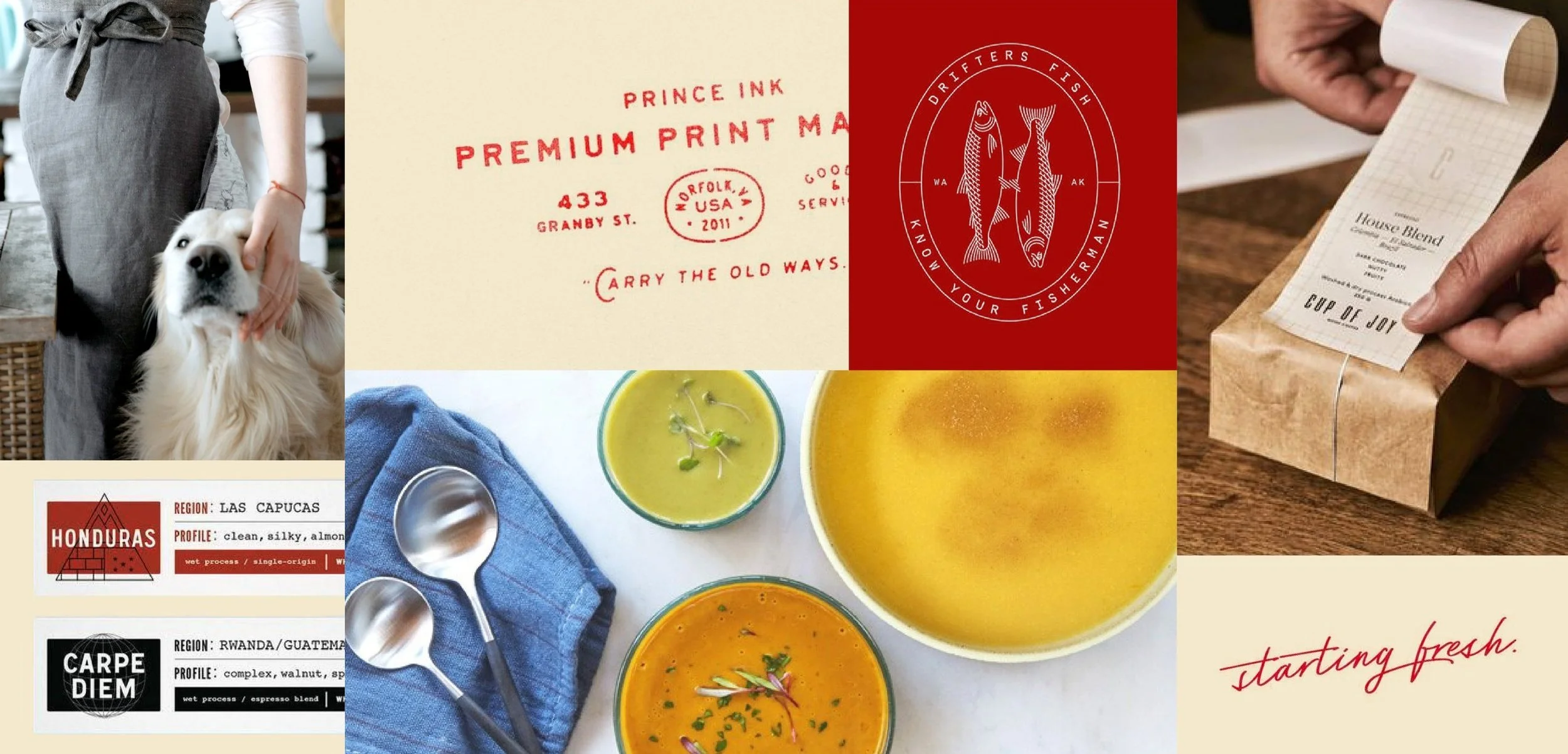
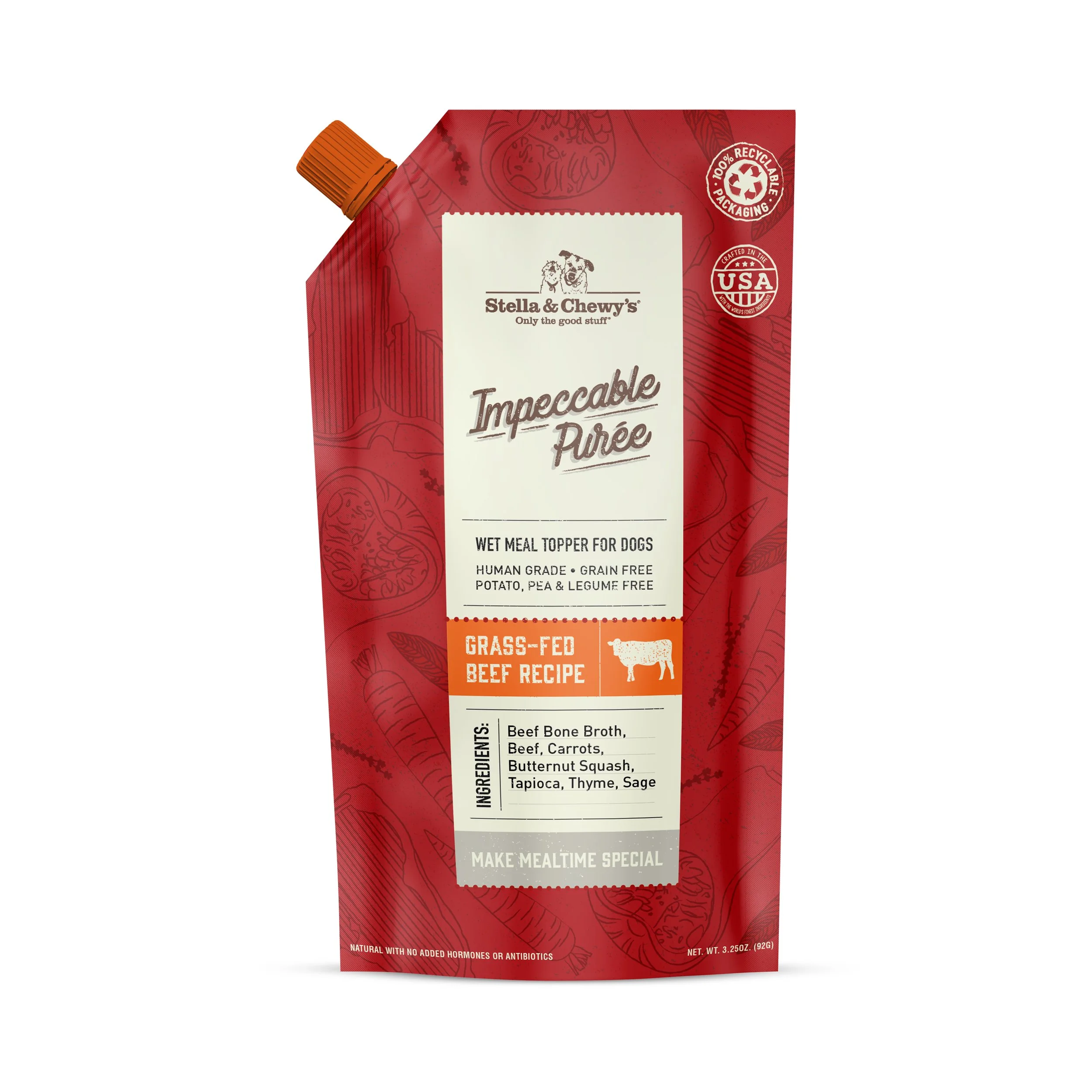
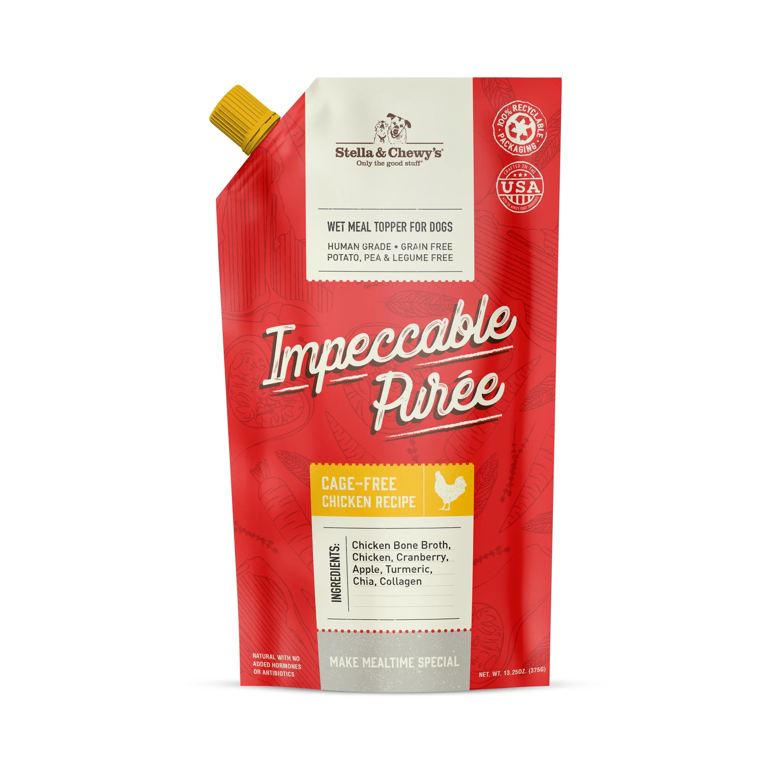
IMPECCABLE PUREE
Impeccable Puree leaned the hardest into a butcheshop aesthetic of the three products, we needed to highlight simplicity of ingredients and simplicity of recipe. We took inspiration from modern simple food products like the RX bar, placing ingredients front and center on pack. We utilized the butcher shop language with the long tag element that framed all our information, plus hinted to the center lockup shield element that is in Stella’s DNA. The illustrations in the background are hand done and highlighted ingredients in each recipe.
Selected vision board
Round 1
Round 2
Design Intent